The Minimalist Marvel: Deconstructing the Spider-Man Symbol
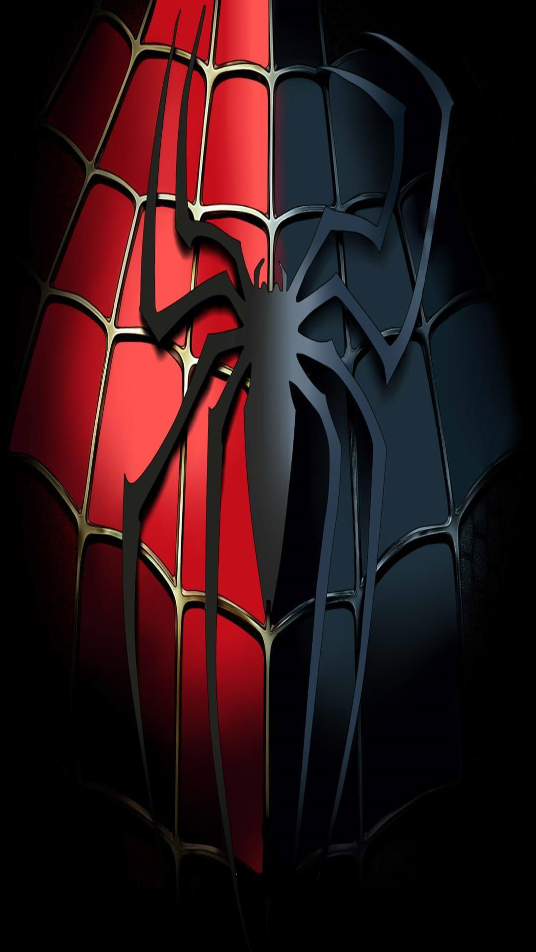
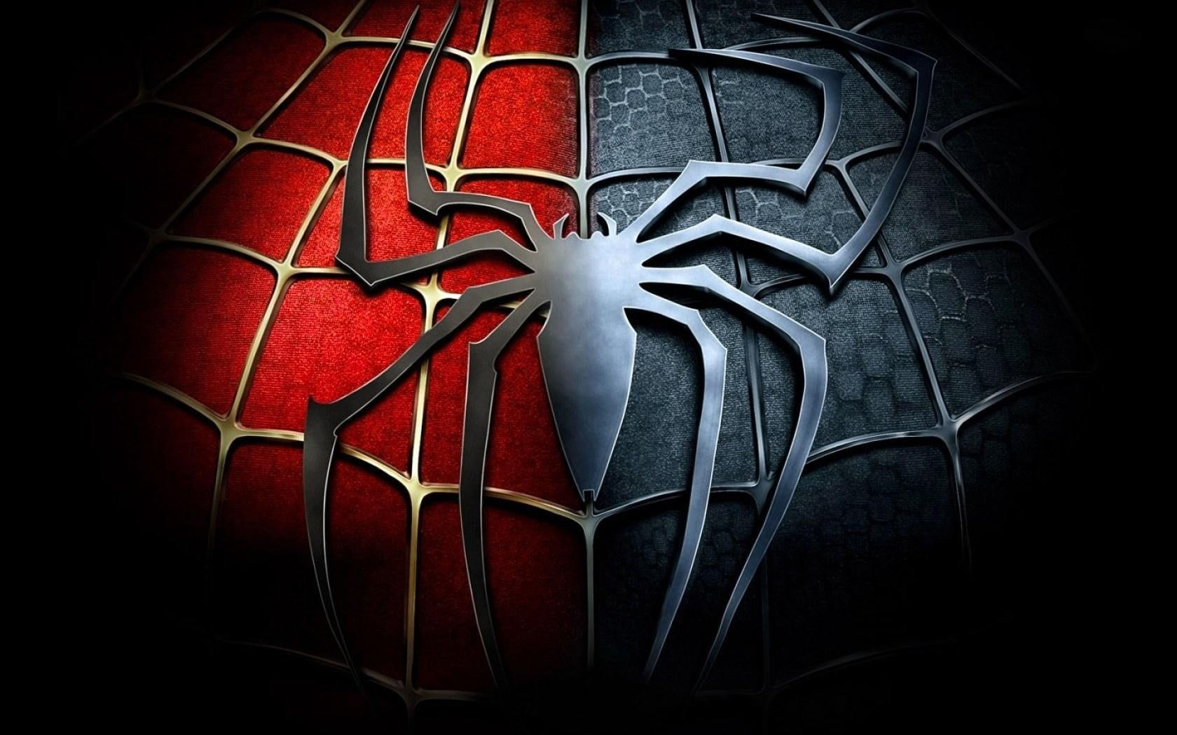
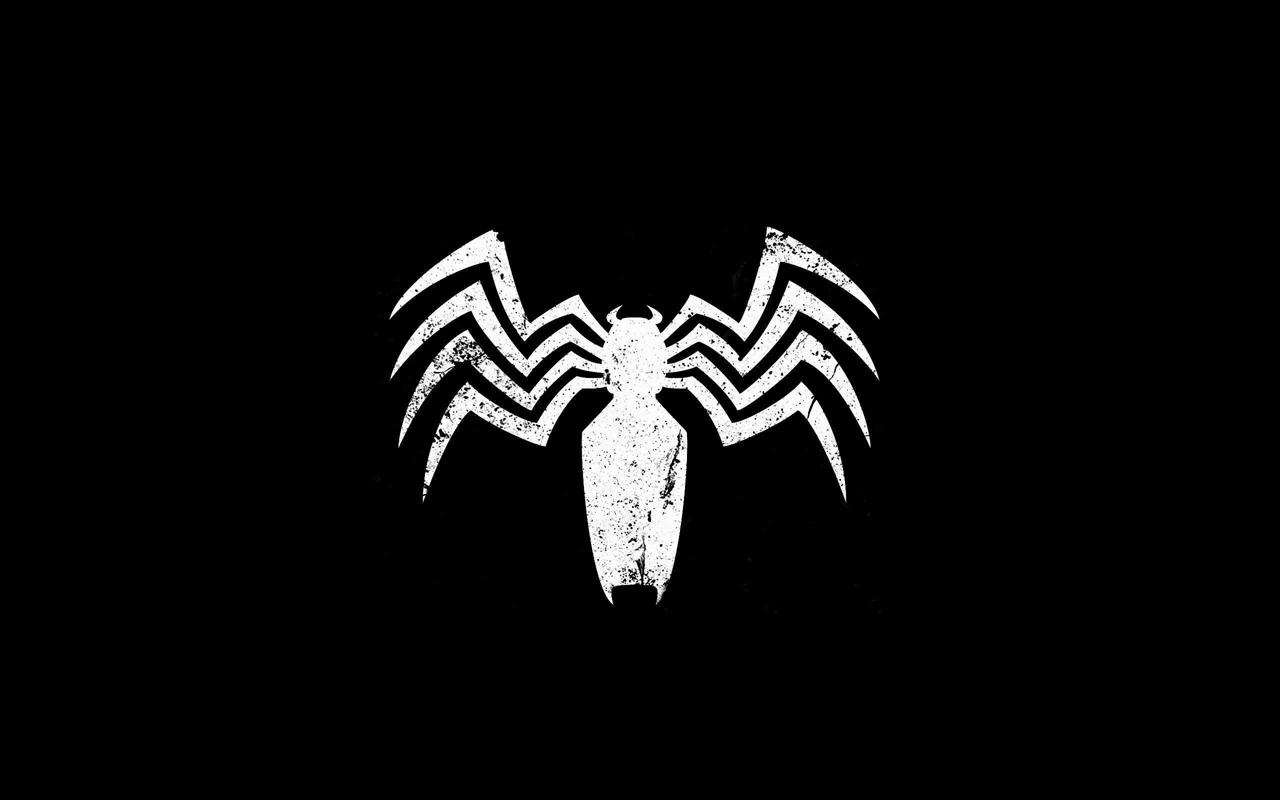
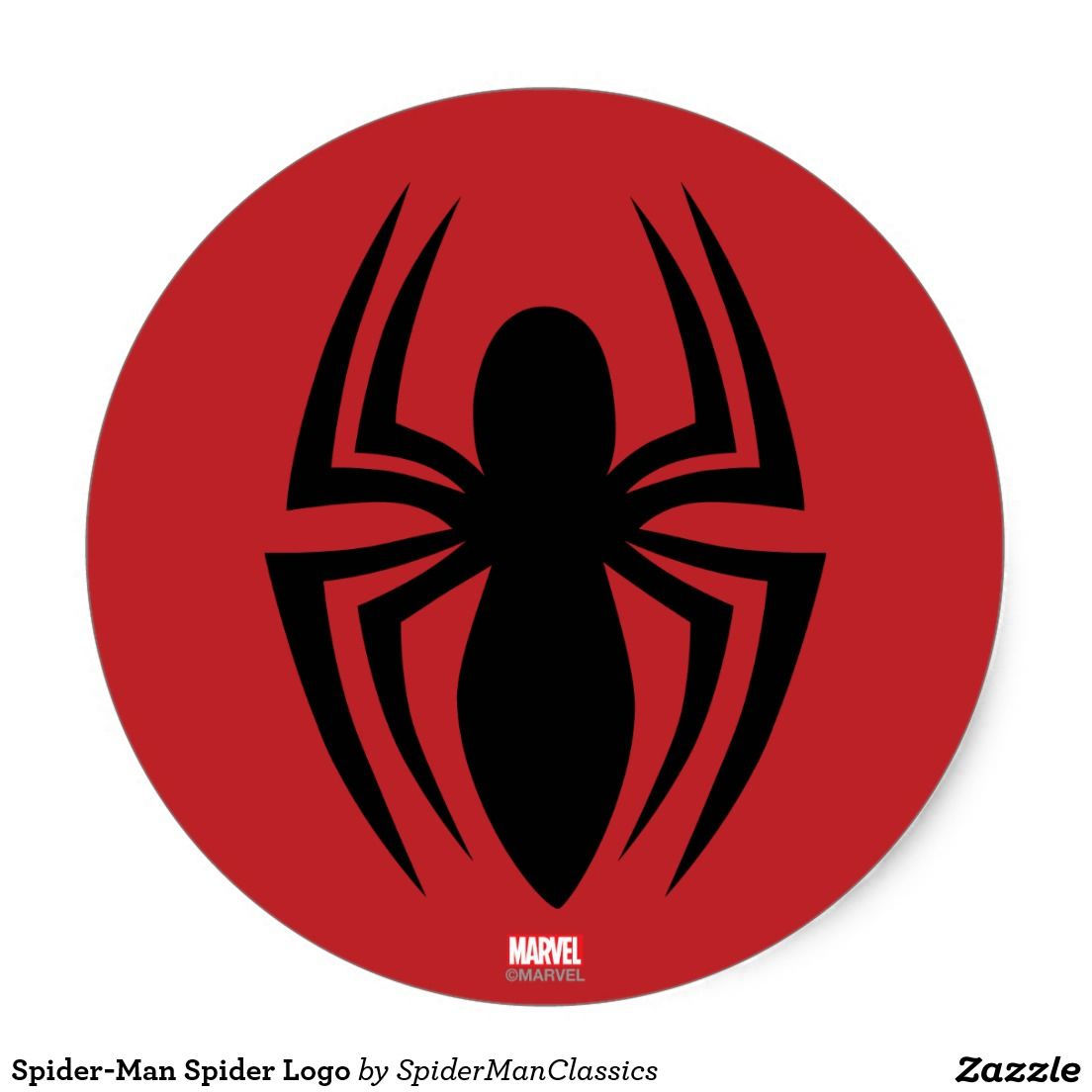
The image before us is deceptively simple. A stark outline of a spider, its eight legs elegantly curving, framed by the bold, stylized lettering "Spider-Man." Yet, within this minimalist design lies a powerful narrative, a testament to the enduring appeal of a beloved superhero, and a fascinating case study in visual branding. This seemingly simple logo carries the weight of decades of comic books, blockbuster films, and countless merchandise, encapsulating the essence of Spider-Man in its clean lines.
The Evolution of an Icon:
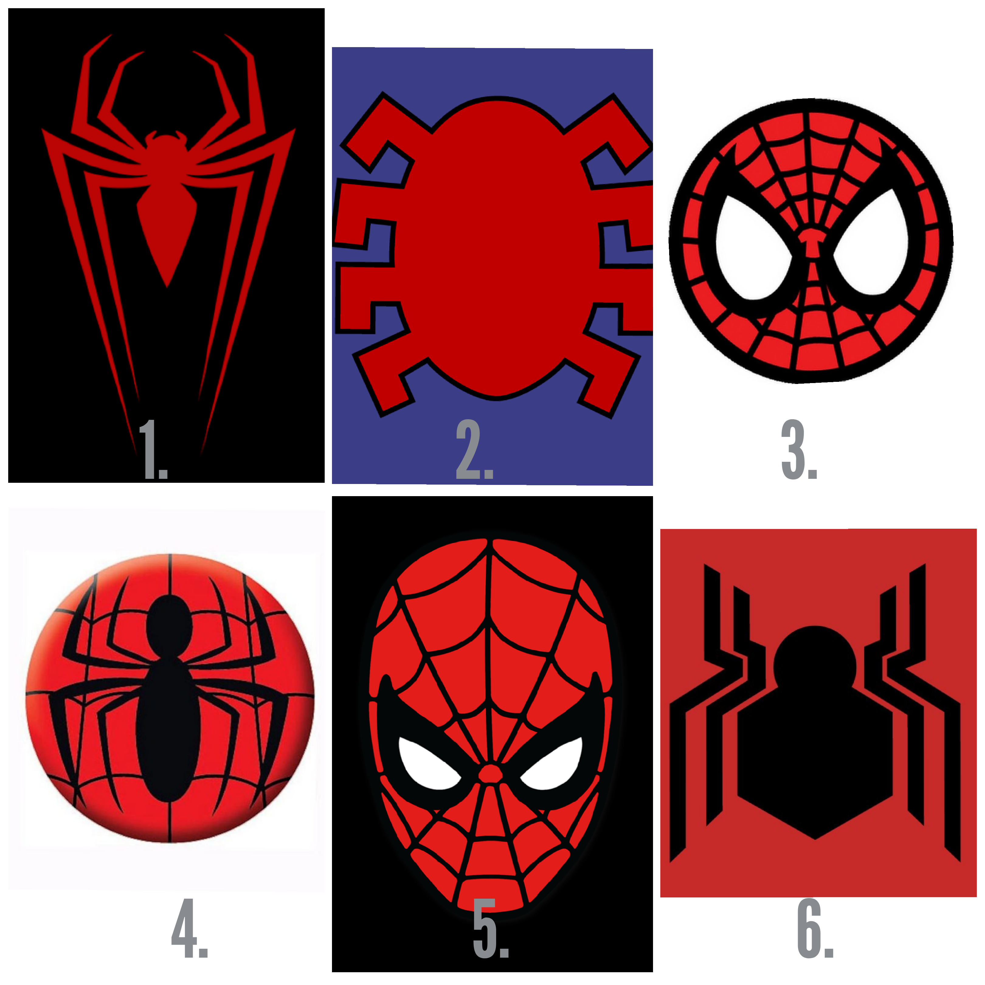
The Spider-Man logo has undergone several iterations since its inception. Early versions were more detailed, featuring a more realistic depiction of a spider, often incorporating the red and blue of the suit. However, the minimalist approach seen in the presented image represents a significant shift, reflecting a trend towards cleaner, more modern design aesthetics, particularly evident in the marketing of the Sam Raimi and Marc Webb film trilogies.
The simplification is not arbitrary. By stripping away unnecessary details, the design emphasizes the core essence of the character: agility, danger, and a subtle sense of menace. The sharp angles of the legs and the almost skeletal appearance of the spider body hint at both the swiftness and the predatory nature of Spider-Man's persona, subtly communicating his power and the inherent threat he poses to his enemies.
The sleek lines of the spider also effectively embody the idea of a web. The way the legs extend and splay outward suggests the radiating structure of a spiderweb, a key element in Spider-Man's visual identity and a symbolic representation of his connections and responsibilities within the city of New York. This minimalist approach achieves a remarkable feat: it retains the immediate recognizability of the character while subtly hinting at his complex nature.
The Power of Simplicity:
The minimalist style of the logo allows for maximum versatility. It's easily adaptable to various mediums and applications, from small merchandise tags to large-scale movie posters. The clean lines translate well across various resolutions and printing methods, ensuring consistent brand recognition. This is a key factor in the success of any iconic logo, and Spider-Man's minimalist symbol is a shining example of effective design.
Moreover, this simplified design allows the viewer's imagination to fill in the gaps. It's not so literal as to constrain the perception of the character. This encourages a more personal connection to the logo, allowing fans to project their own interpretations onto the minimalist form. The inherent ambiguity of the design contributes to its enduring power.
Beyond the Logo: A Story in Lines:
Looking beyond the graphic design, the image evokes a multitude of narratives:
- The Birth of a Hero: We can imagine this logo as a sketch, the first tentative design by a young, aspiring artist, the nascent vision of a character that would captivate the world. The simplicity mirrors the seemingly ordinary beginnings of Peter Parker, before the fateful spider bite.
- A Shadowy Figure: The stark black lines against the white background lend a sense of mystery and intrigue. It calls to mind the nocturnal activities of Spider-Man, his shadowy movements across the city skyline. The logo could represent a fleeting glimpse of the hero, a silent promise of protection.
- A Symbol of Hope: Despite the potentially menacing appearance of the spider, the overall impression is one of elegance and grace. This subtle balance mirrors Spider-Man's character – a powerful figure, yet always striving for good, battling against the darkness with a sense of responsibility and compassion.
The Enduring Legacy:
The image, in its simplicity, encapsulates the lasting impact of Spider-Man. He's more than just a superhero; he's a symbol of resilience, responsibility, and the ability to overcome even the most challenging circumstances. The minimalist logo, in its understated way, perfectly reflects these qualities, continuing to resonate with audiences across generations.
Conclusion:
The minimalist Spider-Man logo is far more than just a corporate symbol. It's a piece of art, a story waiting to be told, and a testament to the enduring power of iconic design. Its success lies not in its complexity, but in its simplicity – a powerful reminder that sometimes, less is indeed more. The stark black lines on a white background serve as a potent visual shorthand for a complex character, embodying his strength, agility, and the quiet heroism that lies at the heart of his being. It's a logo that speaks volumes without uttering a single word. This is why it's not just a logo; it's a legend etched in lines.


