Beyond the Web: Delving into the Gritty Atmosphere of "The Amazing Spider-Man 2" Poster
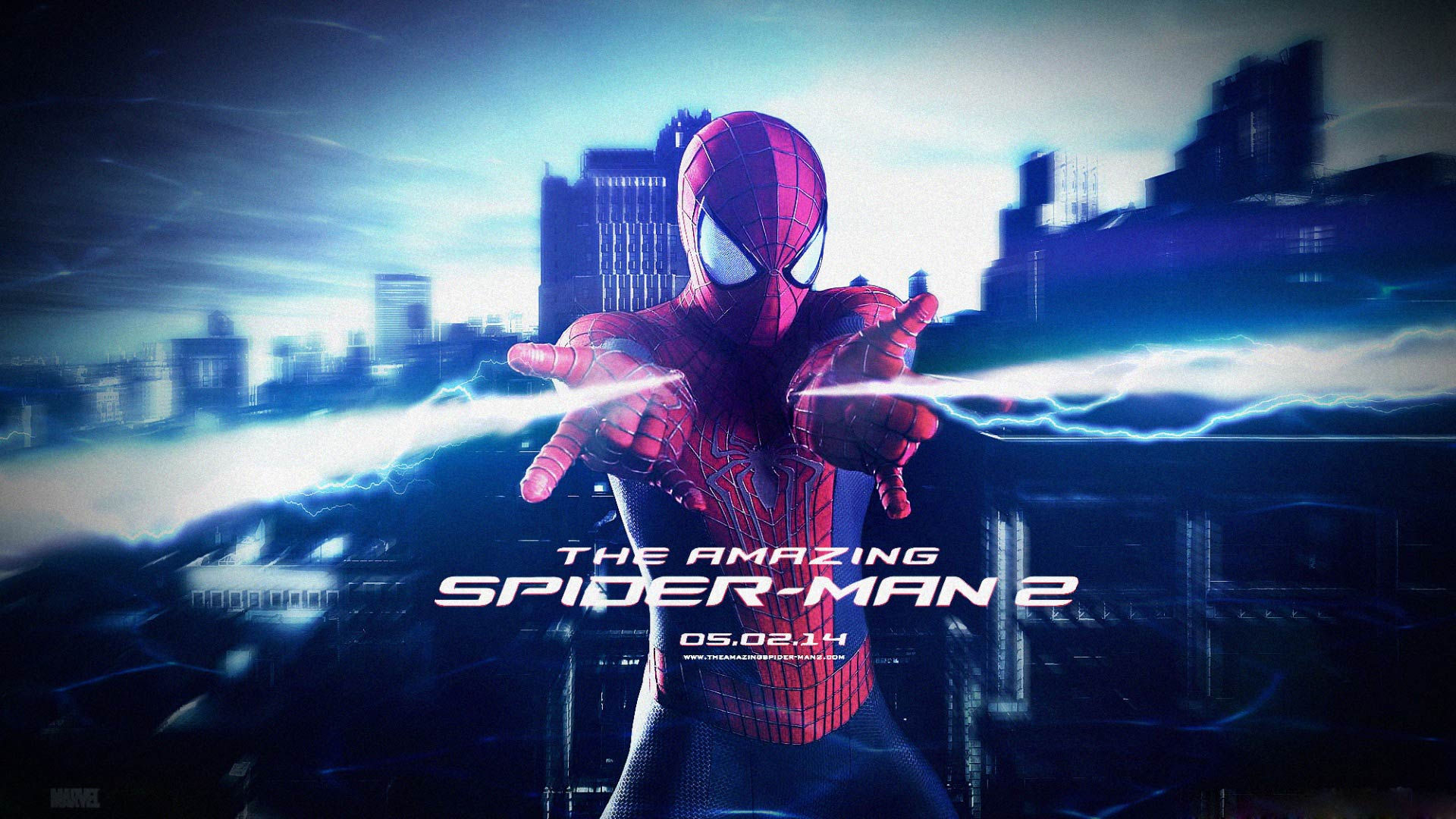
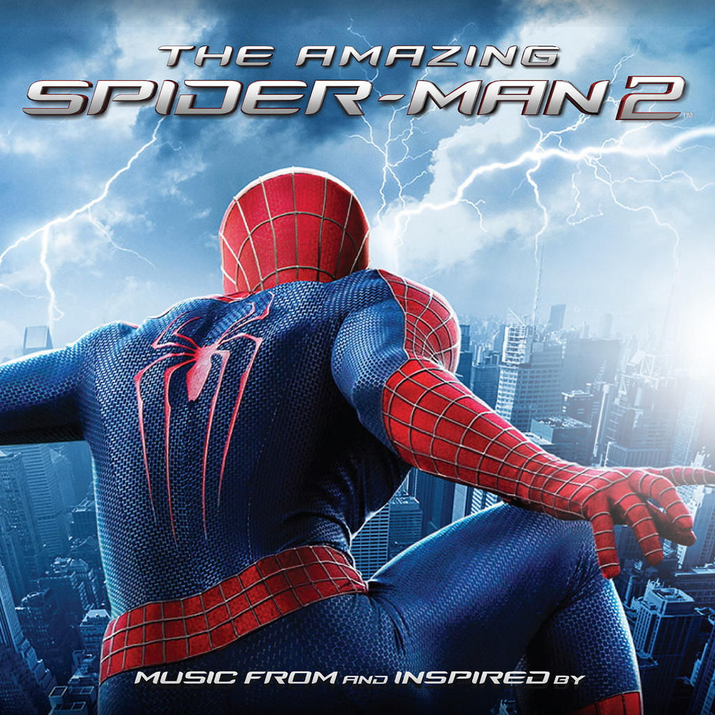
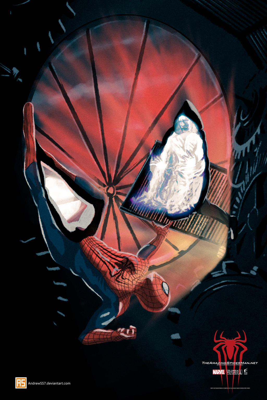
This isn't just a movie poster; it's a snapshot of a city steeped in rain, mystery, and the brooding weight of responsibility. The promotional art for "The Amazing Spider-Man 2," depicted in this image, goes beyond simply showcasing the titular hero. Instead, it plunges us directly into the heart of the narrative, hinting at the darkness and drama that await. Let's unravel the layers of this compelling visual.
A City Drenched in Shadow and Rain:
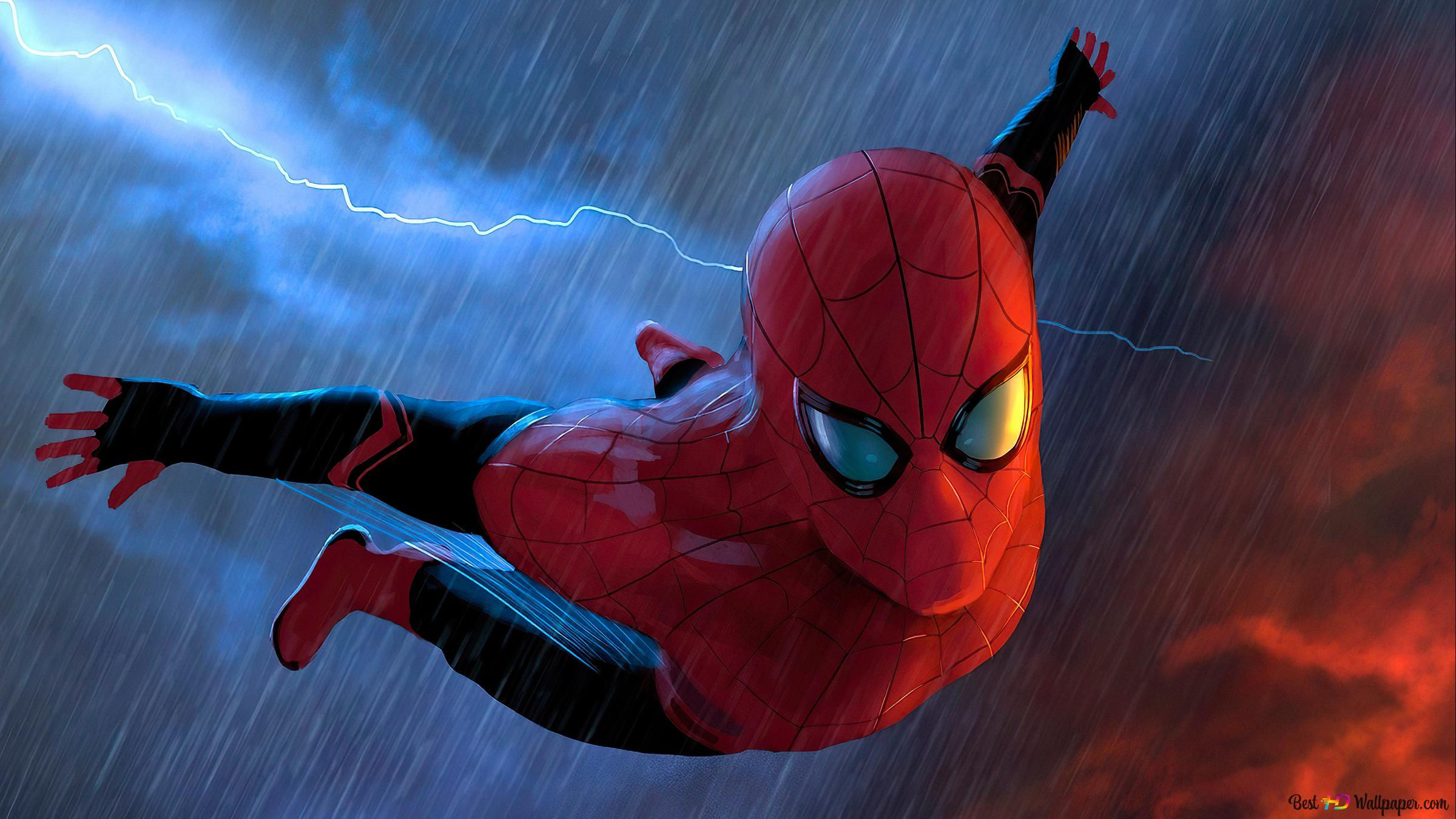
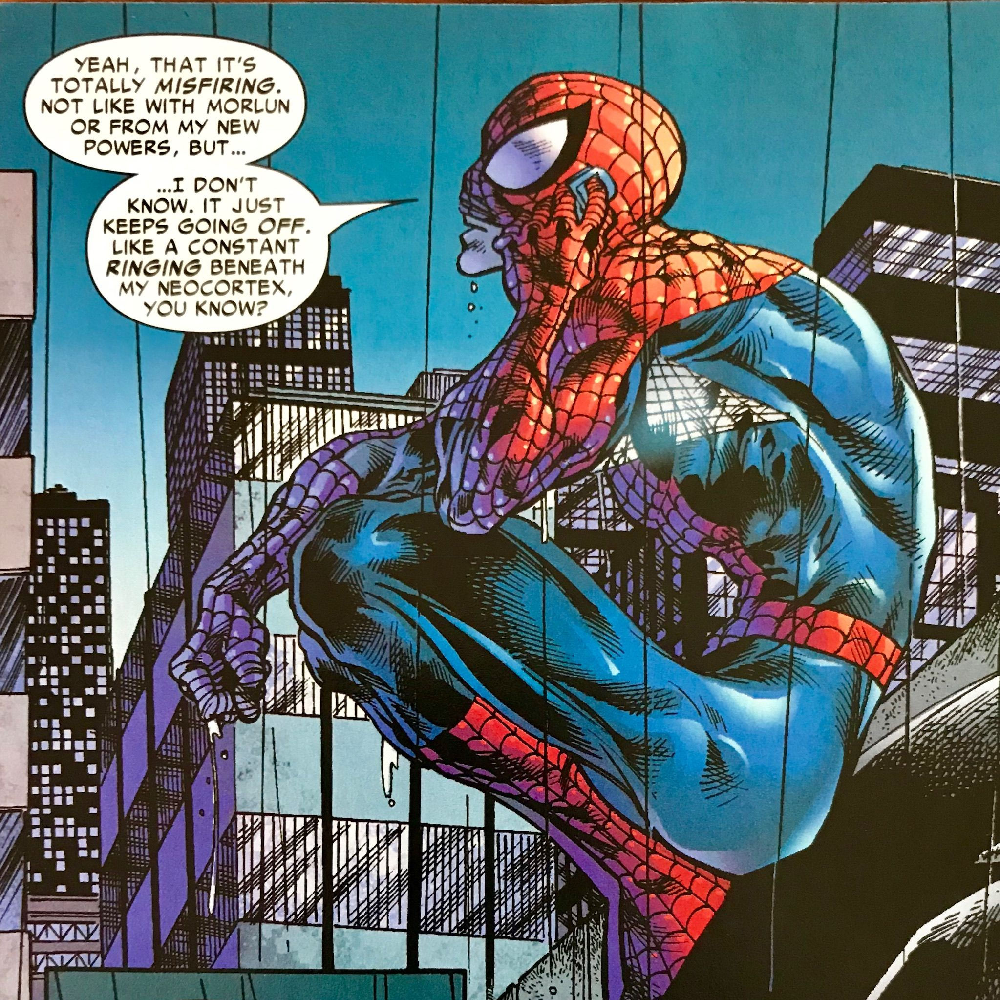
The backdrop is a marvel (pun intended) in itself. A sprawling cityscape, rendered in a grayscale palette punctuated by the cold gleam of city lights, dominates the scene. The rain, a crucial element, isn't just a visual effect; it’s a metaphor. It washes over the buildings, blurring the lines, adding a layer of ambiguity that perfectly mirrors the internal struggles of Peter Parker/Spider-Man. The rain acts as a veil, obscuring details yet simultaneously heightening the sense of unease and the weight of impending events. The muted color scheme amplifies this feeling of urban gloom, suggesting a city harboring secrets and dangers just beneath the surface.
This isn't the bright, shiny New York we often see in superhero films. This is a gritty, realistic portrayal, suggesting a darker, more complex story than its predecessor. The architecture suggests a blend of old and new, of towering skyscrapers juxtaposed with older, potentially more vulnerable buildings – a reflection of the inherent duality within the character of Spider-Man himself, the clash between his youthful energy and the burden of his adult responsibilities.
Spider-Man: A Figure of Both Triumph and Torment:
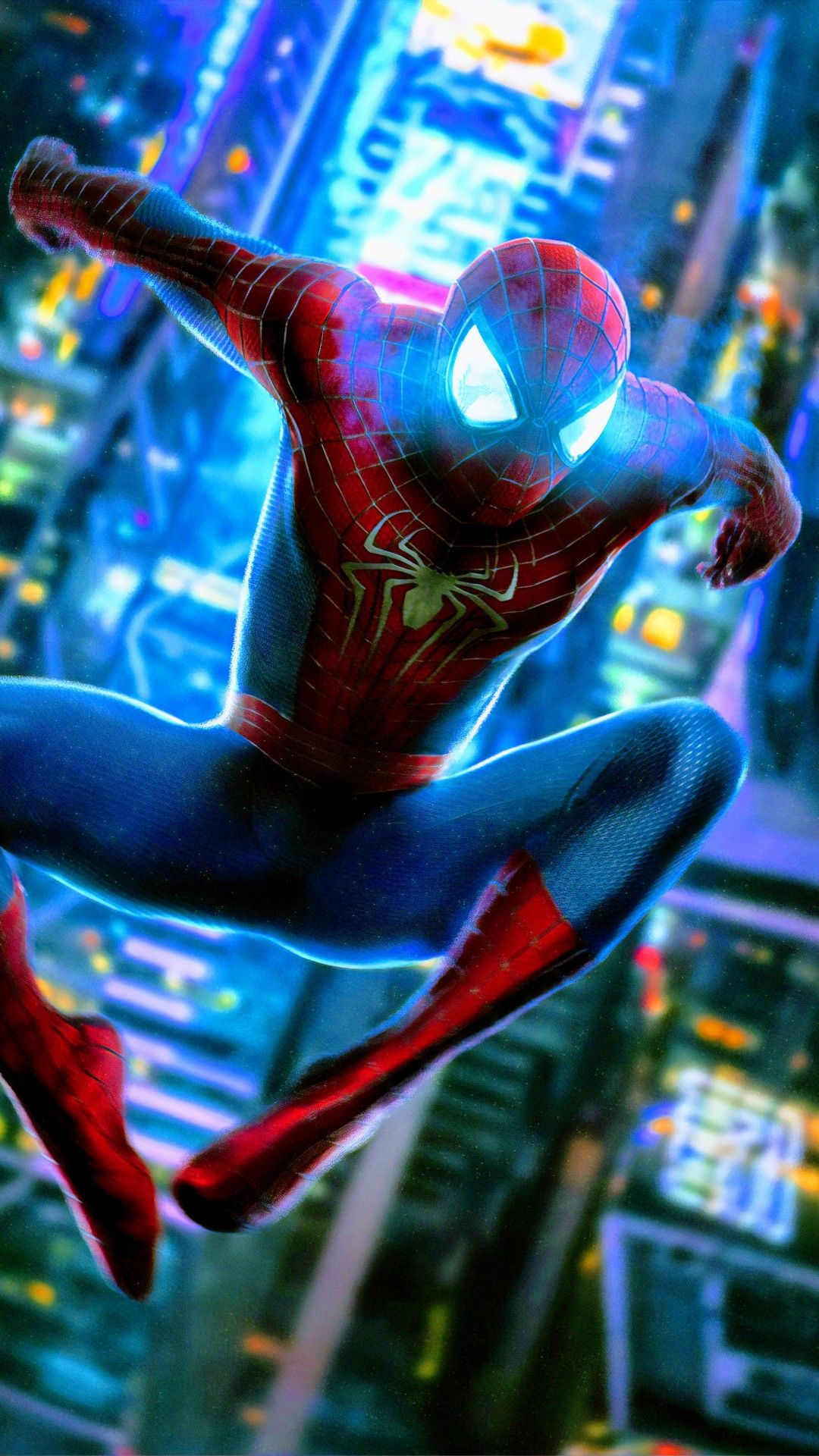
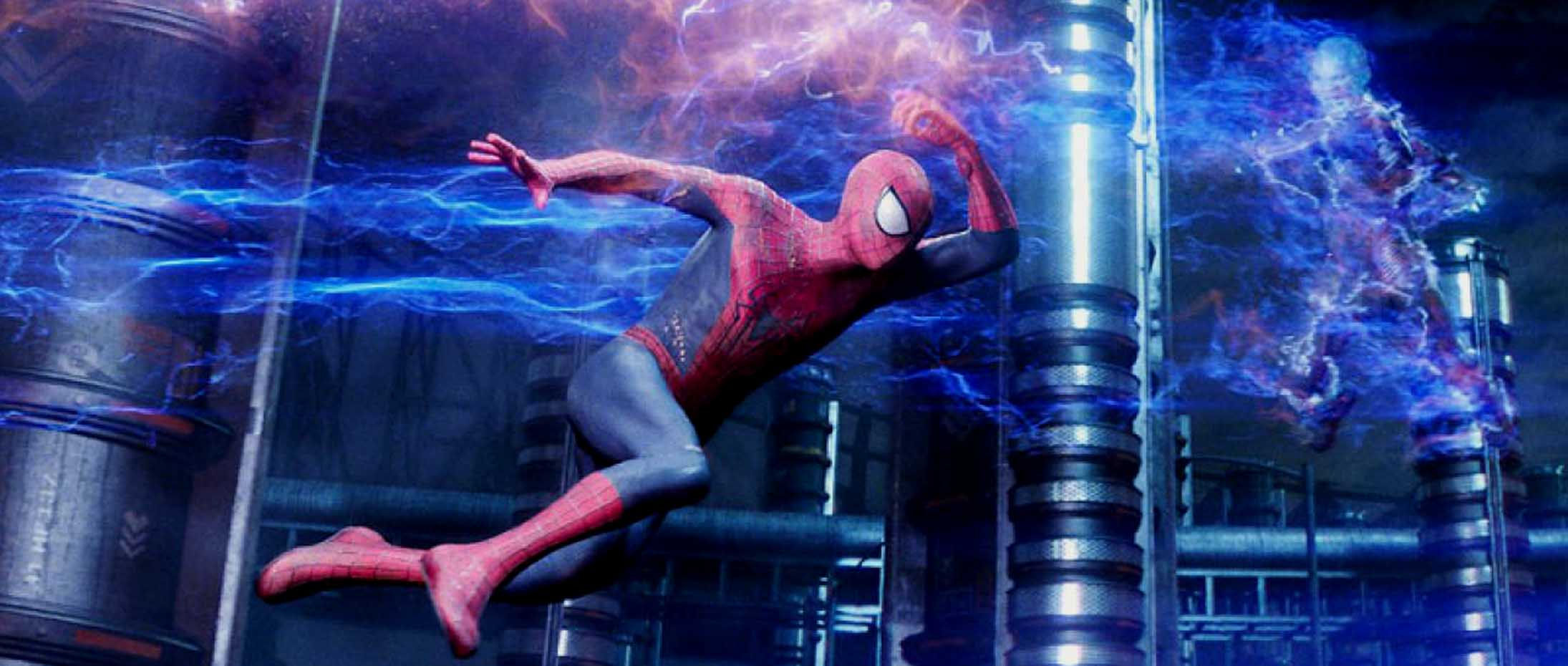
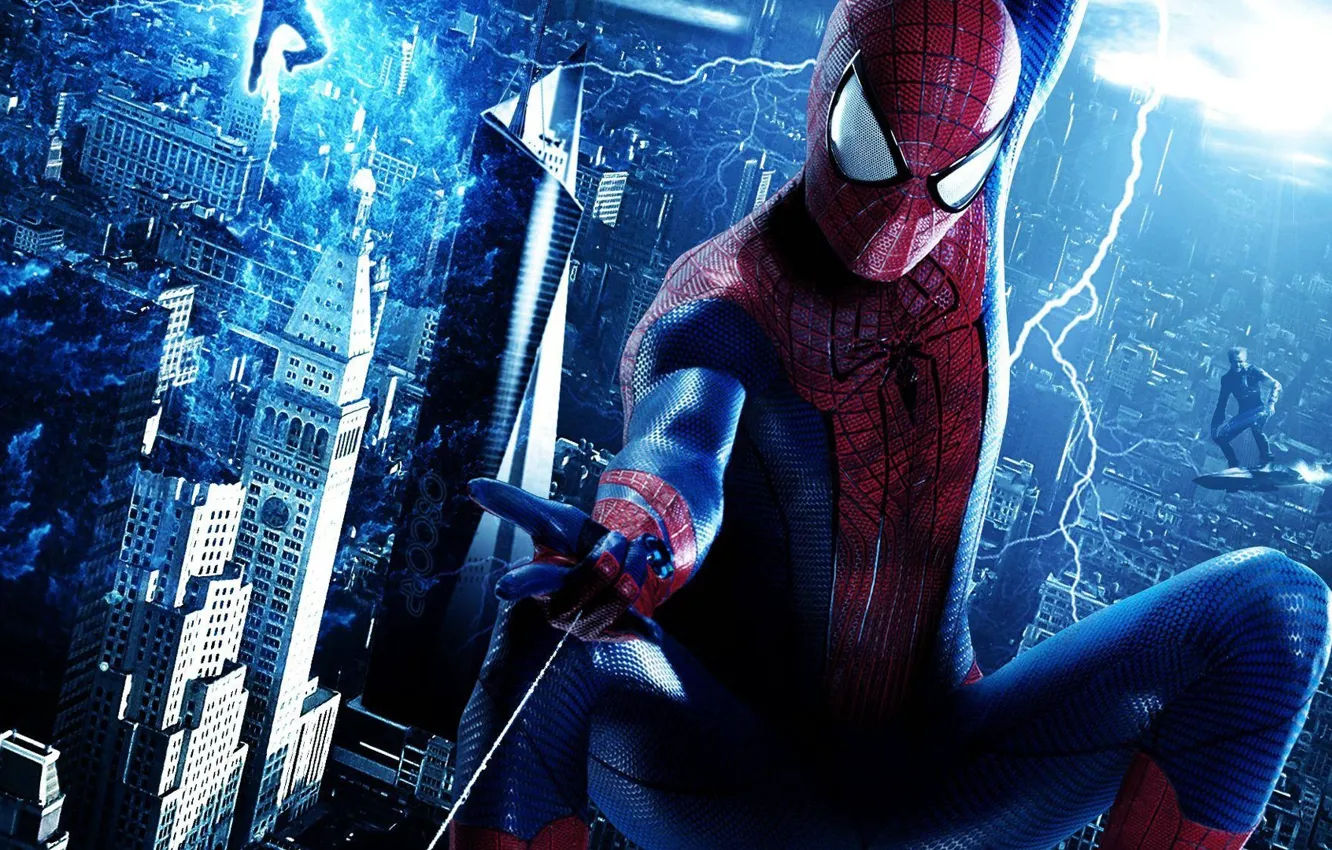
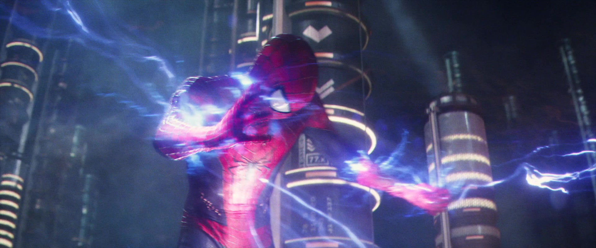
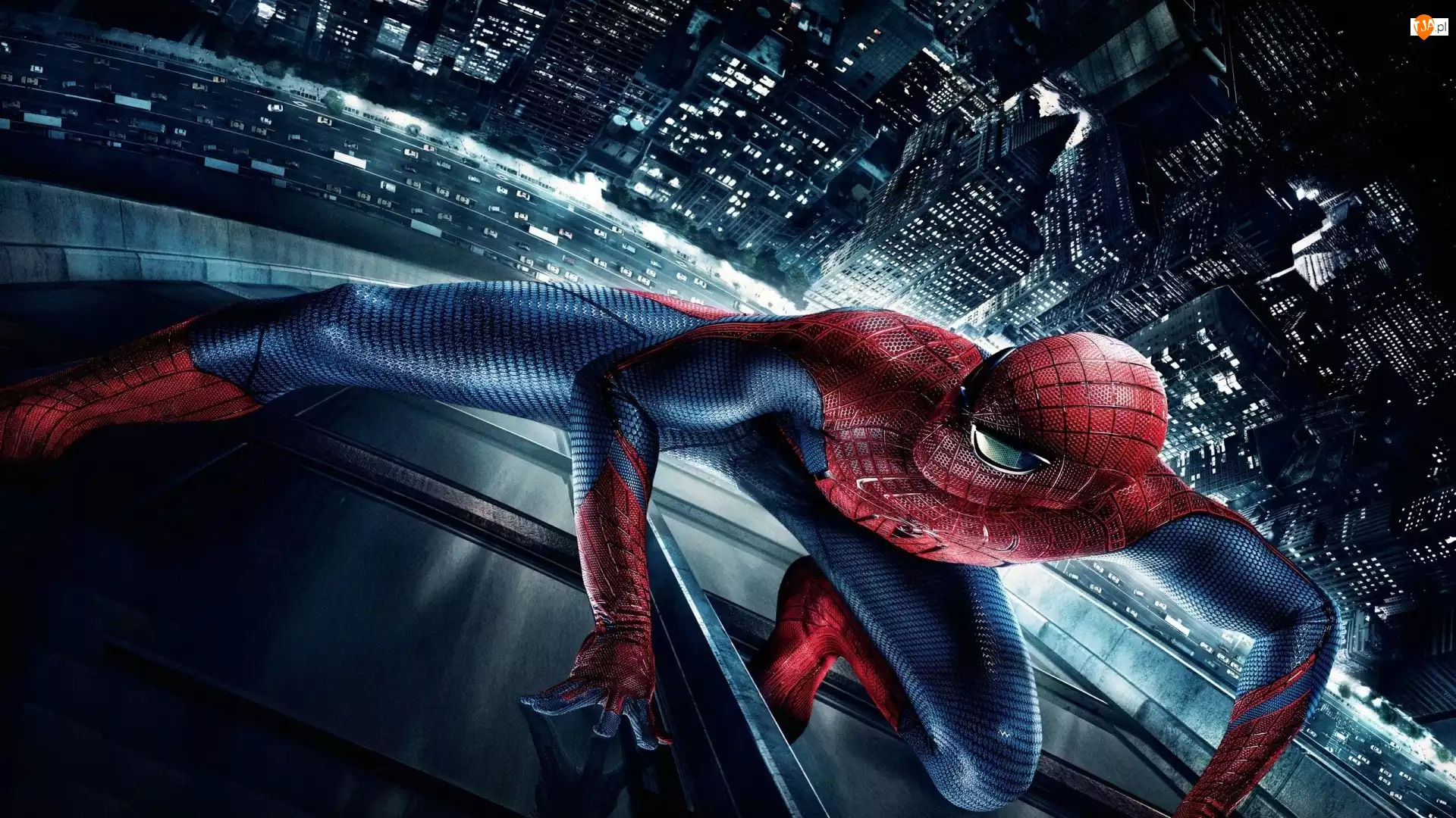
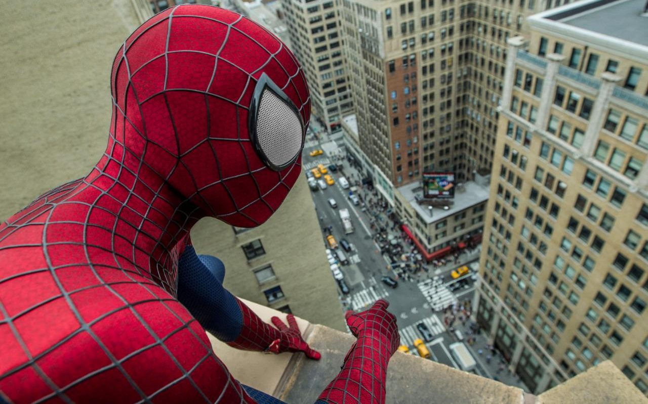
Spider-Man himself is not presented in a triumphant pose, but rather in a dynamic, almost desperate swing. His pose conveys a sense of motion and urgency. His web-slinging is not the effortless grace of a carefree hero; it suggests a struggle, a constant battle against gravity, and by extension, the overwhelming forces arrayed against him. He's not gazing heroically into the distance; his focus is directed towards the viewer, creating an intimate and almost confrontational connection.
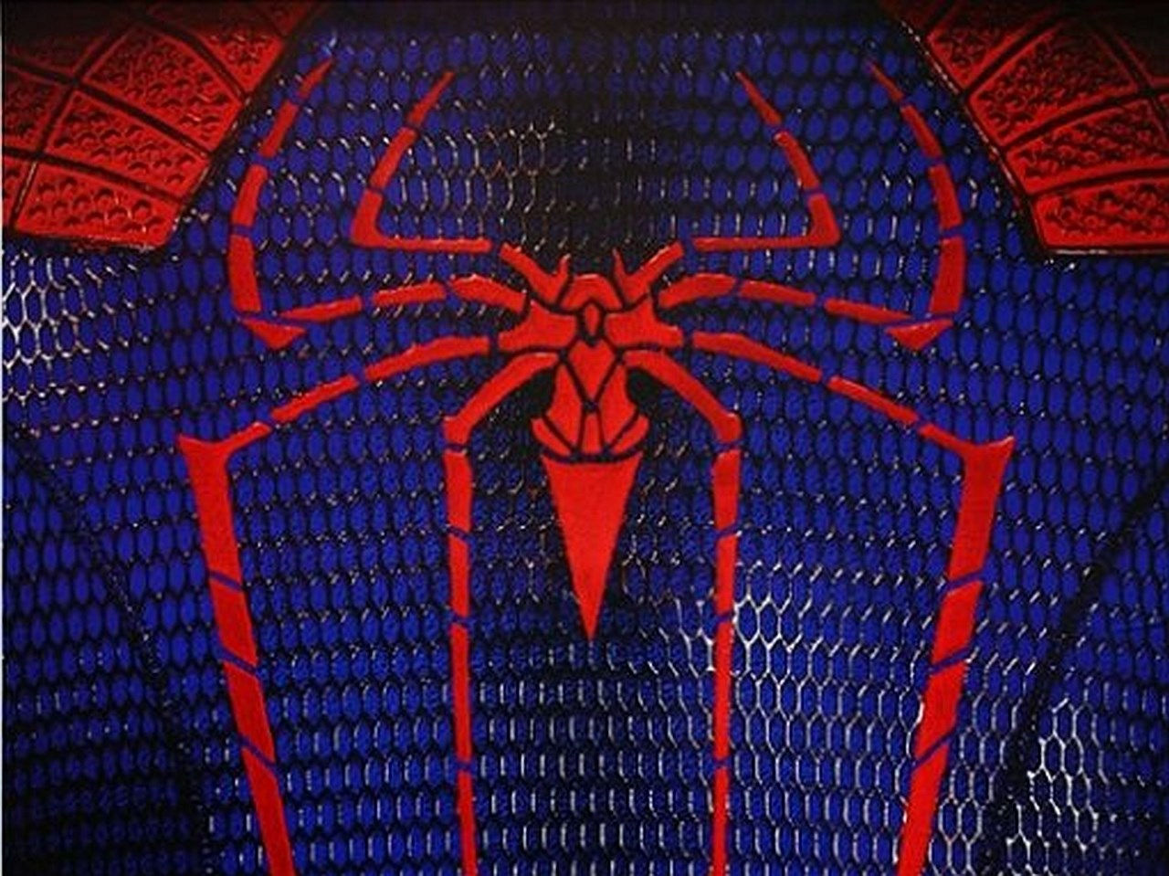
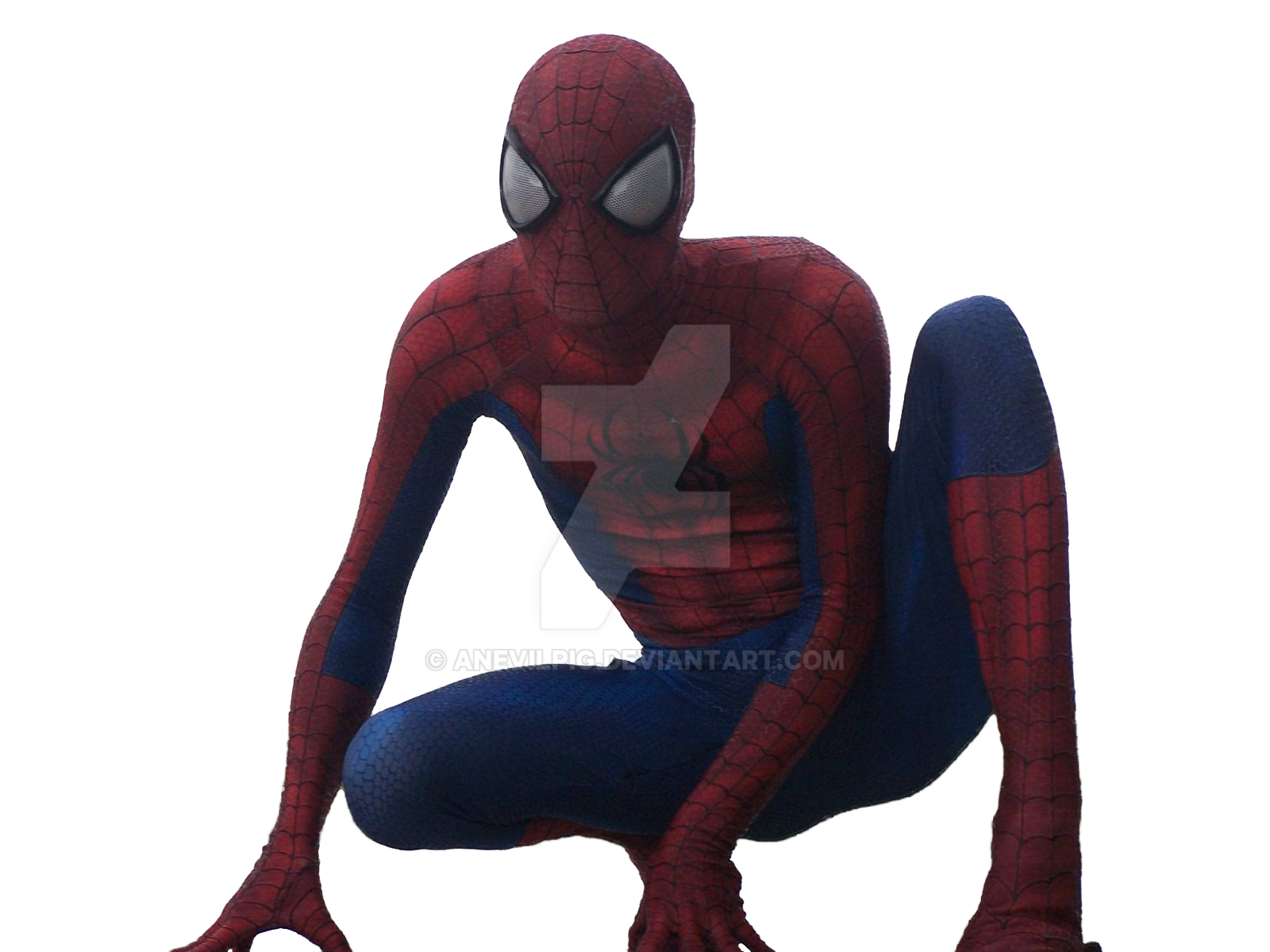
The detail in the suit is significant. It’s not overly polished; it bears the marks of wear and tear, hinting at the toll his life as Spider-Man takes. The rain clings to the fabric, almost adding weight to the physical and emotional burdens he carries. This detailed rendering of the suit moves away from the idealized image often presented and grounds Spider-Man in reality, portraying him as a vulnerable individual fighting amidst the harsh realities of his city.
The Symbolism of the Web:
The web he uses to swing is not just a means of transportation; it's a visual representation of his connection to the city, a net that binds him to its people and its problems. It’s a delicate thread connecting him to those he protects, highlighting the responsibility he carries. The way the web extends upward, almost disappearing into the stormy sky, further emphasizes the vastness of his responsibilities and the challenges he faces.
A Poster Predicting the Narrative:
The overall aesthetic foreshadows the film's darker tone. The rain, the grayscale palette, the dynamic yet strained pose of Spider-Man—all these elements create a powerful visual narrative before even a single frame of the movie is seen. It hints at the internal conflicts, the heavy emotional weight, and the significant challenges that Spider-Man faces in this particular chapter of his story. This poster is not just a promotional image; it's a mood piece, setting the tone and expectations for a more complex and emotionally resonant superhero narrative.
Beyond the Image: Marketing and Fandom
This poster is also a key piece in the larger context of film marketing and fan engagement. Its gritty aesthetic likely aimed to attract a slightly older audience, shifting the focus from a purely family-friendly adventure to a more mature and emotionally driven superhero narrative. It catered to a fanbase that had grown alongside the character, craving a story that explored the darker aspects of being a superhero. The strategic use of the tagline, "Swinging into Cinemas 2014," is simple yet highly effective, evoking the exciting energy and action of the film. The inclusion of 3D and IMAX 3D branding further highlights the immersive experience offered by the movie itself.
The poster is a testament to the power of visual storytelling. It's not just a promotional tool; it's a work of art in its own right, a glimpse into the soul of a city and the complex hero who protects it. It's a testament to the evolution of superhero cinema, moving beyond simplistic narratives to portray the multifaceted nature of heroism, and the burden it carries. This poster is a powerful reminder that sometimes, even the most powerful superhero needs help, and that's perfectly acceptable. The rain, the shadows, and the struggle in Spider-Man's pose all combine to create a far more resonant and thought-provoking image than a simple, triumphant portrayal ever could. This poster lives beyond its promotional purpose, becoming an iconic representation of a particular era in Spider-Man's cinematic history.

